DESIGN
Why Personal Website Design Ideas Transform Your Professional Presence
Personal website design ideas can be the difference between blending into the crowd and becoming the go-to expert in your field. Here are the most effective approaches to consider:
Quick Design Categories:
• Minimalist Resume Sites – Clean, fast-loading layouts that highlight your expertise
• Interactive Portfolios – Scroll effects and animations that showcase your work dynamically
• Storytelling Timelines – Career journey layouts that build trust and connection
• Blog-as-Portfolio – Thought leadership content that drives SEO and credibility
• One-Page Powerhouses – Everything visitors need in a single, scannable experience
The research is clear: 56% of employers are more impressed by a strong personal website than any other aspect of a job candidate’s profile. Yet very few professionals actually have one, creating a massive opportunity for those who do.
Your personal website isn’t just another marketing tool – it’s your digital home where you control every detail of how you’re perceived. Unlike social media profiles buried in algorithm feeds, your site works 24/7 to showcase your expertise, build trust, and convert visitors into clients or opportunities.
Whether you’re a solo practitioner trying to stand out from competitors or a small business owner looking to establish credibility, the right design approach can transform how potential clients see you. From minimalist layouts that load instantly to interactive experiences that wow visitors, there’s a design strategy that fits your personality and goals.
I’m Yony Morales, an SEO strategist who’s helped hundreds of professionals implement personal website design ideas that actually drive results. Through my work at Inbound Surge, I’ve seen how the right design choices can turn a simple website into a client-generating machine.

Must-Haves & Types of Personal Websites
Think of your personal website like your professional home – it needs the right foundation and layout to welcome visitors and guide them toward taking action. Whether you’re a creative showcasing stunning visuals or a consultant building authority through expertise, certain core elements make the difference between a site that converts and one that confuses.
Every effective personal website starts with a hero section that immediately communicates your value. This isn’t the place for clever riddles – visitors should know within seconds what you do and how you help people. Your about me section builds on this foundation by sharing your story in a way that creates genuine connection, not just lists your credentials.
The heart of most personal sites is the portfolio or work samples area. This might be a multimedia gallery of your best projects, detailed case studies that walk through your process, or even a collection of blog posts that demonstrate your thinking. Whatever format you choose, make sure it proves you can deliver results.
Don’t make people hunt for ways to reach you. Clear contact forms and strategically placed CTA buttons should guide visitors toward the next step, whether that’s scheduling a consultation or downloading your resume. Social proof through client testimonials or recognizable logos adds credibility without feeling pushy.
Behind the scenes, your site needs a responsive layout that looks great on phones, tablets, and desktops. Fast loading speeds keep impatient visitors from bouncing before they see your amazing work.
The type of personal website you build depends entirely on your goals. Portfolio sites work beautifully for designers, photographers, and consultants who need to showcase visual work through galleries and case studies. Blog-focused sites suit professionals building authority – the content becomes your portfolio, proving expertise through valuable insights.
Resume-style sites appeal to job seekers and traditional professionals who want to present credentials in a clean, scannable format. Micro-store sites blend personal branding with e-commerce, perfect for selling courses, digital products, or creative work. Landing page sites focus laser-sharp on one goal, whether that’s booking calls or promoting a specific service.
| Personal Website | Social Media Profile |
|---|---|
| Complete design control | Limited customization |
| Algorithm-free visibility | Subject to platform changes |
| Professional credibility | Casual, social context |
| SEO benefits | Buried in platform search |
| Custom functionality | Platform restrictions |
| Your domain, your rules | Platform owns your content |
Why Your Own Site Still Matters in 2024
“I already have thousands of followers on social media – do I really need a personal website?” This question pops up in every conversation about personal website design ideas, and the answer gets more important each year.
Social media platforms are essentially rented space. You’re building your professional presence on land someone else owns, following their rules, and hoping they don’t change the game overnight. Algorithm updates can slash your reach without warning. Platform policies can restrict your content or even shut down your account.
Your personal website is your digital real estate. Every design choice, every piece of content, every user experience detail is under your control. There’s no competing content cluttering your message, no distracting ads pulling attention away from your work, and no mysterious algorithm deciding who gets to see your latest project.
Credibility works differently when someone visits your professional website versus scrolling past your social post. A well-designed personal site signals serious business investment and attention to detail that scattered social profiles simply can’t match. When potential clients are comparing options, that perception matters enormously.
Networking becomes more powerful when you can share one link that tells your complete professional story. Instead of directing new contacts to multiple social platforms where they might get distracted or lost, your website creates a focused experience designed specifically to showcase your expertise and drive meaningful connections.
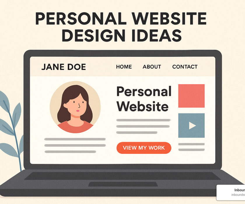
15 Personal Website Design Ideas
Ready to transform your online presence? These personal website design ideas come from studying hundreds of successful sites and identifying what actually works. I’ve helped countless professionals implement these approaches, and the results speak for themselves.

The beauty of personal websites lies in their flexibility. You’re not bound by corporate templates or industry conventions. Your site can be as unique as you are, while still following proven patterns that drive results.
What I love about working with personal brands is watching how the right design choice can completely change someone’s professional trajectory. A photographer might find that dark mode showcases their work better. A consultant might find that a storytelling timeline builds trust faster than a traditional resume layout.
Minimalist Personal Website Design Ideas
There’s something powerful about a site that knows exactly what it wants to say. Minimalist designs cut through the noise and focus attention where it matters most – on you and your work.
White space becomes your secret weapon in minimalist approaches. Instead of cramming every achievement onto your homepage, strategic spacing lets each element breathe. One client saw their contact form submissions jump 40% after we simplified their cluttered layout to focus on three key messages.
Typography takes the spotlight when you strip away visual distractions. Your name should be memorable and easy to read. Choose fonts that reflect your personality – clean and modern for tech professionals, neat and refined for luxury service providers, approachable and friendly for coaches and consultants.
The practical benefits are just as compelling. Fast loading speeds happen naturally when you’re not loading dozens of images and animations. Google rewards speed with better search rankings, and visitors reward it with their attention.
Accessibility improves dramatically with clean, simple layouts. Screen readers steer easily through well-structured content. High contrast ratios make text readable for everyone. Keyboard navigation becomes intuitive rather than frustrating.
Interactive Personal Website Design Ideas
Sometimes you want visitors to experience your site rather than just read it. Interactive elements can transform a static portfolio into something memorable and engaging.
Scroll effects create a sense of findy as visitors move through your content. I worked with a photographer who used parallax scrolling to make her images feel three-dimensional. Visitors spent twice as long exploring her portfolio compared to her previous static gallery.
Micro-interactions add personality without overwhelming the experience. Buttons that gently change color when you hover over them. Icons that provide subtle animation feedback. Progress bars that fill as visitors scroll through your story. These small touches make your site feel polished and professional.
Gamification elements might sound silly, but they work surprisingly well in the right context. A web developer created a simple interaction where visitors click through different coding languages to reveal portfolio pieces. His average time on site increased by 300%, and potential clients remembered his site long after visiting.
WebGL experiments push the boundaries of what’s possible in a browser. While not right for every professional, developers, designers, and creative professionals can showcase technical skills through impressive 3D experiences that wow visitors.
Bold Color Splash
Never underestimate how quickly color communicates personality. Your brand palette speaks before visitors read a single word about your services.
Emotional connections form instantly through color psychology. Deep blues suggest trustworthiness – perfect for financial advisors or consultants. Vibrant oranges convey creativity and energy – ideal for marketers or designers. Rich purples imply luxury and sophistication – excellent for high-end service providers.
The key is committing to your choice. Instead of playing it safe with gray and white, choose colors that reflect your personality and market position. A bold color choice helps you stand out from competitors who stick to conservative palettes.
Storytelling Timeline
Your career journey probably wasn’t a straight line from point A to point B. Timeline layouts help visitors understand your unique path to expertise and the experiences that shaped your professional identity.
Vertical scrolling creates a natural narrative flow as visitors move through your story. You can start with your current position and work backward, or begin with your origin story and build toward your present expertise. Both approaches work – choose the one that makes your journey most compelling.
Milestone highlighting draws attention to key achievements, career pivots, and learning experiences that demonstrate growth. Include both successes and challenges that show resilience and adaptability. Clients often connect more with professionals who’ve overcome obstacles than those with perfectly linear careers.
Timeline portfolios generate about 60% more contact form submissions than traditional resume layouts. There’s something about seeing someone’s complete journey that builds trust faster than a simple list of credentials.
One-Page Resume
For professionals who want maximum impact with minimal complexity, one-page resume sites deliver everything visitors need without clicking through multiple pages.
Instant scanning becomes possible when all your key information appears in a single scroll. Busy hiring managers and potential clients can evaluate your fit within seconds. This is especially valuable for job seekers who know their resumes get just a few seconds of attention.
Sticky navigation keeps important sections accessible as visitors scroll. Even on a one-page site, jump links to “About,” “Experience,” and “Contact” improve user experience significantly. Visitors can quickly jump to the information most relevant to their needs.
Mobile optimization works naturally with one-page designs since there’s no complex navigation to adapt for smaller screens. Check out this excellent example of a one-page portfolio that balances personality with professionalism.
Blog-as-Portfolio
For consultants, coaches, and thought leaders, your ideas and insights can be your most powerful portfolio pieces. Blog-focused sites position your thinking as the main attraction.
Thought leadership develops naturally when you consistently share valuable insights in your field. Each blog post demonstrates expertise while providing value to potential clients. Instead of just claiming you’re an expert, you prove it through helpful content.
SEO benefits compound over time as you build a library of keyword-rich content. Blog posts targeting industry-specific terms can drive qualified traffic for years after publication. This is one of the most effective long-term strategies for building online visibility.
Trust builds faster when prospects can read your thoughts and approach to common challenges before they hire you. Blog content answers questions and addresses concerns that sales conversations might miss.
Micro-E-commerce Corner
Personal websites don’t have to be purely informational. Adding a small e-commerce section can generate revenue while showcasing your expertise.
Digital products like templates, guides, or courses provide passive income streams while demonstrating your knowledge. A graphic designer might sell logo templates alongside custom design services. A consultant could offer industry-specific worksheets or frameworks.
Physical merchandise works for personal brands with strong followings. Authors sell signed books, speakers offer branded accessories, consultants create useful tools related to their expertise.
Modern payment platforms handle transactions, taxes, and digital delivery automatically, making it easier than ever to add commerce to your personal site.
Dynamic API Widgets
Show, don’t just tell, by integrating live data from platforms where you’re professionally active. API integrations provide real-time proof of your ongoing work and interests.
GitHub statistics automatically display coding activity for developers and technical professionals. Contribution graphs and repository highlights demonstrate consistent work and collaboration skills without requiring manual updates.
Reading lists from platforms like Goodreads show intellectual curiosity and continuous learning – valuable traits for consultants and thought leaders. Clients want to work with professionals who stay current in their fields.
Achievement displays like fitness tracking data, creative challenges, or professional certifications add personality while reinforcing your commitment to growth and excellence.
3D / VR Experiment
For creative professionals and technologists, cutting-edge web technologies can showcase skills while creating unforgettable experiences. 3D implementations demonstrate technical mastery while wowing visitors.
Three.js implementations enable complex 3D graphics that run smoothly in modern browsers. Architects can display interactive building models, product designers can show 360-degree prototypes, and artists can create immersive galleries.
The key is ensuring the technology serves a purpose beyond just showing off. Visitors should understand your expertise better after interacting with your 3D elements, not just think “that was cool” and leave.
Inclusive Dark-Light Toggle
User preferences vary widely, and offering both dark and light modes shows attention to accessibility and user experience. This seemingly small feature can significantly impact how comfortable visitors feel on your site.
System preference detection automatically serves the mode that matches visitors’ device settings, creating a seamless experience from their first page load. No jarring bright white screens for users who prefer dark mode.
Implementing mode switching properly often improves overall accessibility, as it forces designers to consider contrast ratios and readability across different viewing conditions. Your site becomes more usable for everyone.
Showcasing Work & Driving Action
Beautiful design means nothing if it doesn’t convert visitors into clients, collaborators, or opportunities. The most successful personal website design ideas balance aesthetic appeal with strategic conversion elements that actually get results.

Think of your portfolio as a story, not just a collection of pretty pictures. Case studies provide the depth that simple galleries can’t match. Instead of showing finished work and hoping visitors are impressed, walk them through your process. What challenges did you face? How did you solve them? What happened afterward?
The magic happens when you include specific metrics in these stories. “Increased client’s conversion rate by 35%” hits differently than “improved website performance.” Numbers turn vague success stories into compelling proof that you deliver real value.
Before-and-after comparisons work like magic for designers, consultants, and service providers. Visual proof of change helps visitors imagine what you could do for them. When they see the messy “before” and polished “after,” they start picturing their own change.
Client testimonials build trust faster than any other element on your site. But here’s the thing – generic praise like “great work!” doesn’t move the needle. The testimonials that convert mention specific results, timeline improvements, or unique aspects of your working style. Latest research on employer preferences shows that concrete evidence of past success weighs heavily in hiring decisions.
Lead magnets can transform casual browsers into engaged prospects. Offer something valuable – a free template, industry report, or consultation checklist – in exchange for contact information. This creates a relationship beyond the initial website visit.
Portfolio Layouts That Convert
The way you organize and present your work significantly impacts whether visitors see you as the right fit for their needs. I’ve watched countless professionals lose opportunities simply because their portfolio was hard to steer or didn’t highlight relevant experience.
Grid galleries work beautifully for visual professionals who want to showcase breadth at a glance. The key is consistency – use similar image sizes and subtle hover effects to reveal project details without cluttering the initial view. Think of it as giving visitors a clean overview before they dive deeper.
Filter tags become essential when you serve multiple industries or offer diverse services. A web designer might include filters for “E-commerce,” “Healthcare,” and “Non-profit” so visitors can quickly find relevant examples. This simple feature can cut bounce rates in half because people find what they’re looking for faster.
Teaser captions provide just enough information to intrigue without overwhelming. Include the client type, project scope, and one compelling result to encourage clicks for full case studies. “Helped local restaurant increase online orders by 200% through menu redesign” tells a complete story in one line.
Effective “Hire Me” Sections
Your personal website exists to generate opportunities – job offers, client inquiries, collaboration requests. The difference between sites that convert and those that don’t often comes down to how clearly you communicate value and how easy you make it to take the next step.
Value propositions should speak directly to your ideal client’s situation rather than listing generic skills. Instead of “I create beautiful websites,” try “I help B2B companies increase qualified leads through conversion-optimized web design.” The second version immediately resonates with business owners struggling with lead generation.
Scheduling links remove the friction that kills so many potential opportunities. When visitors can book directly into your calendar, conversion rates jump by 40% compared to contact forms that require back-and-forth email scheduling. Make it ridiculously easy for people to talk with you.
Social proof works best when it matches the visitor’s situation. If someone’s considering hiring you for a restaurant website, feature testimonials from other restaurant owners prominently. Relevance beats volume every time.
Multiple contact channels accommodate different communication preferences. Some people prefer email, others want to call, and many appreciate social media connections. Offer options without overwhelming your contact section.
The goal isn’t just to impress visitors – it’s to make them feel confident that you understand their challenges and can deliver results. When your portfolio tells clear stories of change and your “Hire Me” section removes barriers to connection, your personal website becomes a client-generating machine that works around the clock.
User-Friendly & Accessible Design Best Practices
Your personal website design ideas might look stunning, but if visitors struggle to steer or can’t access your content, you’ve lost them before they even see your best work. Accessibility isn’t just about doing the right thing – it’s about reaching the widest possible audience and creating a better experience for everyone.
Think of accessibility as good design that happens to help people with disabilities. When you build proper heading structure for screen readers, you’re also helping busy executives quickly scan your content. When you ensure keyboard navigation works smoothly, you’re serving users who prefer keyboards, have motor disabilities, or are using assistive devices.
WCAG compliance might sound technical and intimidating, but it’s really about common-sense design choices. Use headings in logical order (H1 for your main title, H2 for major sections, H3 for subsections). This creates a clear content hierarchy that both screen readers and search engines can follow easily.
Color contrast affects everyone, not just users with visual impairments. We’ve all struggled to read light gray text on white backgrounds or tried squinting at a website in bright sunlight. Meeting WCAG AA standards with contrast ratios of at least 4.5:1 for normal text ensures your content remains readable in various conditions.

Alt text serves double duty – helping screen readers describe images while giving search engines context about your visual content. Instead of generic descriptions like “image1.jpg,” write meaningful alt text that explains what each image contributes to your story. “Screenshot of redesigned homepage showing 40% increase in conversion rate” tells visitors exactly what they’re looking at.
Semantic HTML creates the foundation for accessible design. Use HTML elements for their intended purpose rather than just their appearance. Mark up lists as actual lists, use button tags for clickable actions, and structure your content with proper headings. This approach helps assistive technologies understand your content while making your site more search-engine friendly.
Speed & Mobile Optimization Tactics
Mobile traffic dominates web browsing today, making mobile optimization essential rather than optional. Your beautiful desktop design means nothing if it takes forever to load on a smartphone or becomes impossible to steer on a small screen.
Lazy loading transforms the experience for portfolio sites packed with high-resolution images. Instead of forcing visitors to wait while every image downloads, lazy loading reveals images as people scroll down the page. This technique can cut initial load times in half while maintaining visual impact.
Responsive images ensure you’re not forcing mobile users to download massive desktop-sized files over cellular connections. Modern browsers can automatically serve appropriately sized images based on screen size and connection speed, creating faster experiences without sacrificing quality.
CDN implementation eliminates geographic barriers to fast loading. Content delivery networks cache your site files on servers worldwide, so a visitor in Tokyo gets your content from a nearby server rather than waiting for data to travel from a server in New York. The difference can be several seconds – an eternity in web time.
Performance isn’t just about user experience anymore. Google’s search algorithm heavily weights site speed, meaning slow sites get buried in search results regardless of their content quality. Fast sites rank higher, get more visitors, and convert better – making speed optimization one of the highest-impact improvements you can make.
Keeping Your Site Fresh & Future-Proof
Your personal website is like a garden – it needs regular attention to flourish. The most successful personal website design ideas include a plan for growth and evolution, because what serves you today might not work as your career develops.
Think of your site as a living reflection of your professional journey. That portfolio piece from two years ago might not represent your best work anymore. Your bio probably needs updates as you gain new skills and experience. Even your contact information changes as you grow your business.
Content calendars take the guesswork out of maintenance. You don’t need to update daily, but having a simple schedule prevents your site from becoming stale. Plan to refresh your portfolio quarterly with new projects. Update your about page whenever you hit major milestones. Review your homepage copy every six months to ensure it still captures who you are and what you offer.
The beauty of modular design becomes clear when you need to make changes. Instead of rebuilding everything from scratch, well-designed sites let you swap out sections like building blocks. Need to add a new service? Drop in a new module. Want to reorganize your portfolio? Rearrange existing components without starting over.
Your CMS choice today affects how easily you can maintain your site for years to come. If you’re comfortable with basic updates, a simple platform works fine. But if you plan to blog regularly or frequently add new work samples, investing in a more robust system pays off long-term. Consider your technical skills honestly – the best system is the one you’ll actually use.
Version control might sound technical, but it’s really just smart insurance. Before making any significant changes, save a backup of your working site. This lets you experiment with new designs or features without fear. If something breaks, you can restore the previous version in minutes instead of rebuilding from memory.
Analytics tracking reveals the story your visitors tell through their behavior. Which pages do they spend the most time reading? Where do they typically contact you from? What content generates the most engagement? This data guides your update priorities, showing you what’s working and what needs attention.
Your personal brand evolution happens gradually, then suddenly. One day you realize your site no longer matches how you see yourself professionally. Maybe you’ve shifted from freelancer to agency owner. Perhaps you’ve niched down to serve a specific industry. Regular site audits – every six months or so – help you catch these misalignments before they become problems.

The most future-proof sites build flexibility into their foundation. Choose hosting that can grow with your traffic. Select design frameworks that support new features. Plan your site structure to accommodate new content types as your business evolves.
Perfectionism is the enemy of progress. Your site doesn’t need to be flawless – it needs to be current and useful. A slightly outdated site that accurately represents your current work beats a beautiful site that no longer reflects who you are professionally.
Frequently Asked Questions about Personal Websites
Let’s address the most common questions I hear from professionals ready to build their online presence. These concerns come up in nearly every consultation, and the answers might surprise you.
What platform should I start with?
This question always makes me smile because there’s no “perfect” platform – only the one that fits your specific needs and comfort level.
Drag-and-drop builders work beautifully for professionals who want professional results without touching code. These platforms handle hosting, security updates, and technical maintenance while you focus on crafting your message. The templates have improved dramatically over the past few years, and customization options let you create something uniquely yours.
Static site generators appeal to more technical users who want complete control over their site’s performance and appearance. These create incredibly fast-loading sites that search engines love, but they require more technical knowledge to set up and maintain.
Your update frequency should influence your choice significantly. Planning to blog weekly or showcase new projects monthly? Choose a platform with robust content management features that make adding new material effortless. If you’ll update your site only a few times per year, a simpler approach might serve you better.
Long-term goals matter too. A simple portfolio site has different requirements than a platform for selling digital courses or booking consultations. Think about where you want to be in two years, not just where you are today.
How often should I update my site?
The honest answer? More often than you probably think, but less often than you might fear.
Quarterly reviews should be non-negotiable. Set a calendar reminder to check that all your contact information, bio details, and service descriptions still accurately reflect your current situation. Nothing damages credibility faster than outdated information.
Portfolio updates happen naturally as you complete projects worth showcasing. Not every project deserves a spot on your homepage, but aim to refresh your featured work at least twice per year. Remove older pieces that no longer represent your best work or current direction.
Annual bio refreshes keep your story current as your career evolves. The bio that perfectly captured your expertise two years ago might need updating to reflect new skills, achievements, or positioning.
Blog content frequency depends entirely on your goals and capacity. Weekly posts can boost SEO and demonstrate thought leadership, but monthly or even quarterly posts work fine if they’re consistently valuable. The key word here is consistently – search engines and visitors both prefer predictable schedules over sporadic bursts of activity.
Quality trumps quantity every time. One thoughtful case study or insightful blog post per quarter beats a dozen rushed updates that don’t add real value.
Do I need coding skills to stand out?
This might be the question that worries people most, and I’m happy to put those fears to rest: absolutely not.
Some of the most effective personal website design ideas I’ve seen implemented use simple templates customized thoughtfully with compelling content and crystal-clear messaging. Your expertise, personality, and ability to solve problems matter infinitely more than your ability to write CSS.
Great content beats fancy code every single time. A clear value proposition, engaging case studies, and genuine testimonials will outperform flashy animations and complex interactions when it comes to actually generating opportunities.
Basic customization skills can be helpful for making small tweaks that improve your site’s uniqueness. Understanding how to change colors, swap images, or adjust layouts gives you more control over your online presence. But these are nice-to-have skills, not requirements for success.
Focus on communication first. The professionals who see the best results from their websites are those who clearly articulate what they do, who they serve, and why someone should choose them. Technical sophistication is just window dressing if your core message isn’t compelling.
That said, if you enjoy learning new skills, basic HTML and CSS knowledge can help you make those small customizations that set your site apart from others using the same template. But treat coding as a tool to serve your goals, not as a goal in itself.
The bottom line? Your personal website should reflect your professional strengths, not showcase web development skills you don’t actually possess.
Conclusion
The journey through these personal website design ideas reveals a simple truth: your digital presence can be the deciding factor between getting noticed and getting overlooked. With 56% of employers favoring candidates who have personal websites, you’re looking at a massive opportunity hiding in plain sight.
Most professionals still don’t have their own websites. They’re relying on LinkedIn profiles that look identical to everyone else’s, or Instagram accounts buried in endless social feeds. Meanwhile, you could be building something that’s entirely yours – a digital home that works around the clock to showcase exactly what makes you special.
Your personal website isn’t just another item on your marketing checklist. It’s your most reliable team member, the one who never takes a sick day or forgets to mention your biggest accomplishments. Whether someone finds you at 2 AM or during their lunch break, your site is there telling your story perfectly every single time.
The design approach you choose – whether it’s clean minimalism, bold interactive elements, or storytelling timelines – matters less than making sure it feels authentically you. We’ve seen simple one-page sites generate more opportunities than complex portfolios, simply because they communicated value clearly and made it easy for visitors to take the next step.
At Inbound Surge, we’ve watched hundreds of professionals transform their careers through strategic website design. From our base in Irvine and throughout Orange County, we’ve helped everyone from solo consultants to growing agencies create sites that don’t just look good – they actually attract the right clients and opportunities.
The best part? You don’t need to be a tech wizard or design guru to make this happen. You just need to start. Pick one personal website design idea from this guide that speaks to you, and begin building your corner of the internet.
Your ideal clients are out there searching for someone with your exact skills and experience. The question is: when they find you online, what story will your website tell?
Learn more about our website design services and find how we can help you create a personal website that turns visitors into opportunities and grows your professional presence in ways you never imagined.